Just like human beings, our blogs grow, change, and take
new dimensions.
After blogging for 1.5 years with my own self-made template
and blog header, I needed Life In Positudiness to get a new face, and its
design and colors to be more reflective of my personality.
A couple months ago, after researching on the Internet and particularly Etsy for
some good web designs that inspired me, I found Color Crush Creative. The designer, Ce Ce, specializes in simple
designs with pop of colors. I only saw a
couple of her designs and I knew right away that it was what I needed. When I contacted her, she informed me that
she was still in the process of building her shop, therefore quite busy, but
she accepted to work with me anyways. We
hit it off pretty quickly; she is such a sweet person!!
I loved working with Ce Ce on this. She was very professional in the way she
handled the process. I felt comfortable
emailing back and forth with her because I realized that she really wanted me
to be happy with my new design.
The process
1. In order to start the designing process, Ce Ce had me
fill out a form to learn about my needs and desires and to give her the general
information such as my links to social media, welcome message and more.
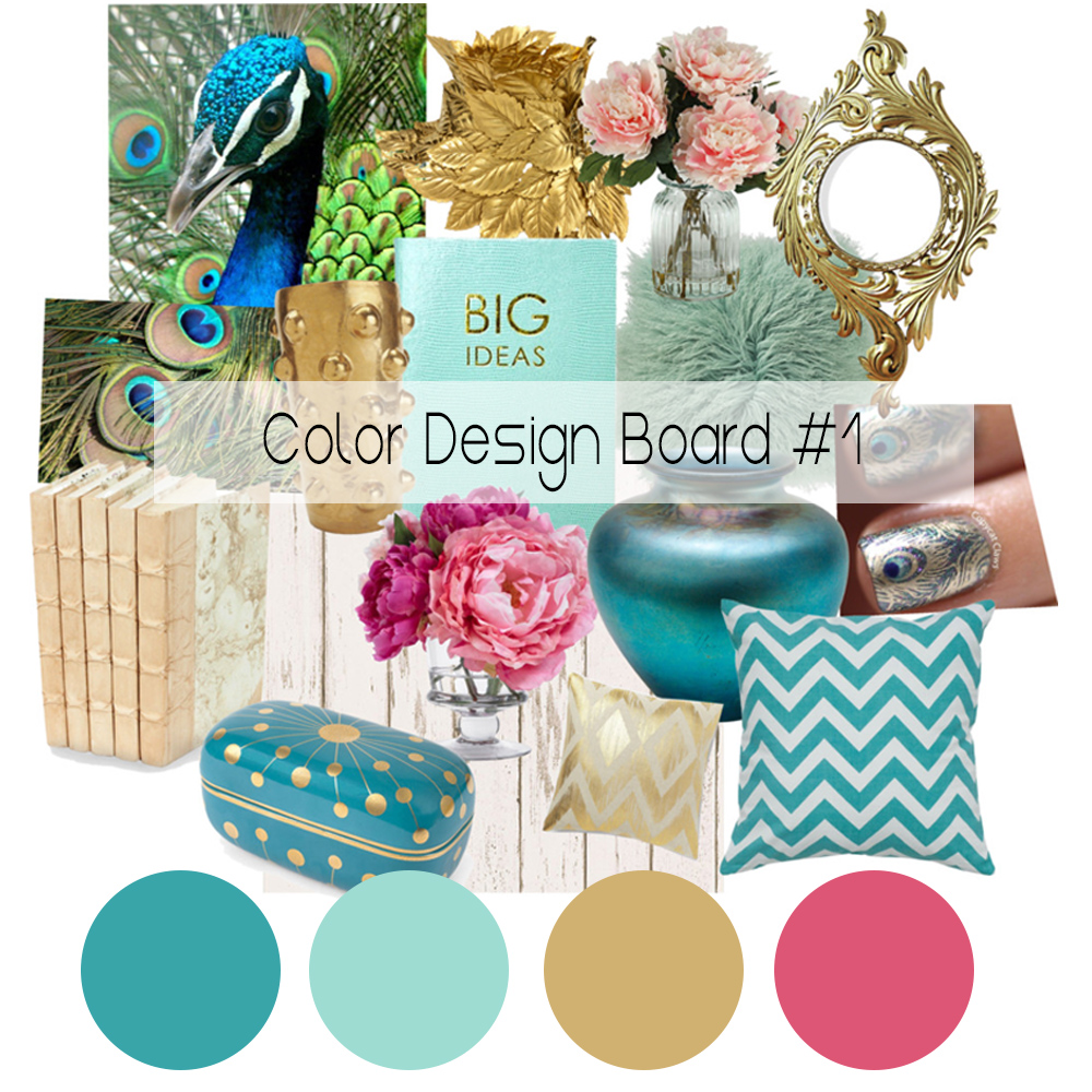
2. Ce Ce asked me to put together a Mood-Board with pictures
that inspired me in order for her to pull out the color theme from it.
Here is the board I created in Polyvore with the colors Ce
Ce pulled out from the pictures.
3. The biggest job was designing my Blog Header. I believe
that it’s the most important thing on a blog, a big eye catcher kinda
thing. Ce Ce was fantastic and really
took the time to listen to my needs.
After a few trials with different fonts and colors (which Ce Ce had me
pick) she made this simple yet bold and beautiful header. She added a touch of gold foil to it – I was
in love!!
4. The Welcome Picture and Text are adorable. The format, fonts
and colors Ce Ce used are simply just what I wanted (and she didn’t even ask
me, she’s that good!!) ;)
5. I used to have my Navigation Bar fixed under the blog header.
I had a lot of pages; it was a mess. Ce Ce asked if I wanted it to be fixed
when scrolling down and which pages where the most important to me. Now you can
scroll up and down LIP and the Nav Bar stays along for easy click to another
page or social media! Love that!!
6. Lastly, Ce Ce asked me to check the rest of the blog design,
which included the side bar widgets, the fonts and colors in the blog posts, etc.
It was a really fun and exciting process. To see my new blog
take form in the live blog template Ce Ce provided me with was amazing! I was
like a little girl in a candy store looking at all the colors and pretty things
she had for me.
Not only did she do a great job with the design, she was a
wonderful person to work with.
I hope you guys have been loving LIP's new design as much as I do. :)
Thank you dearly Color Crush Creative for making this an
fantastic experience.


No comments:
Post a Comment